
Most investors have used charts to decide on different stocks or commodities. The chart of security tends to be an excellent starting point for analyzing an investment, but it is not the only method used. Charts work because they can analyze a great deal of information instantly. For the best investing advice, looking at information beyond a chart is advisable.
What do Charts do?
A chart can show how security has performed over a set period of time. An investor can look at the five-year chart of a business and figure out how well if it has increased or decreased over that time period. It can show how volatile the shares are. If it rises and falls in value quickly, the share is more volatile than a share that increases slowly over a set period of time.
Long before computers were able to stream data, charts were used to create trading strategies. They were originally created by hand and were extremely time intensive. Every time the security closed for the day, the new data point would be added. As technology has developed, computers have made it easy to create and view charts. This has made them more popular among technical analysts and average investors. A simple chart can now display a great deal of information. It can illustrate fundamentals, the struggle between buyers and sellers, and trends. Since history is known to repeat itself, past trends can be useful for forecasting future price fluctuations.
Patterns on a Chart
In general, chart patterns show investors if security will move in a certain direction over a period of time. Technical analysts have two terms for the different patterns: reversal and continuation. With a reversal pattern, the chart signals that the former trend will reverse once the pattern ends. A continuation pattern shows that the former trend will continue after the pattern is complete.
The biggest issue with using chart patterns is that it is not an exact science. For many financial analysts, a chart and signals are more of an art. Certain components are commonly included, but price patterns will not always match the pattern that is included on the chart. Although this is problematic for investors, it does not mean that charts should be completely ignored. If someone understands the basics of how a chart works, they can use volume and other indicators to enhance the benefits of charting.
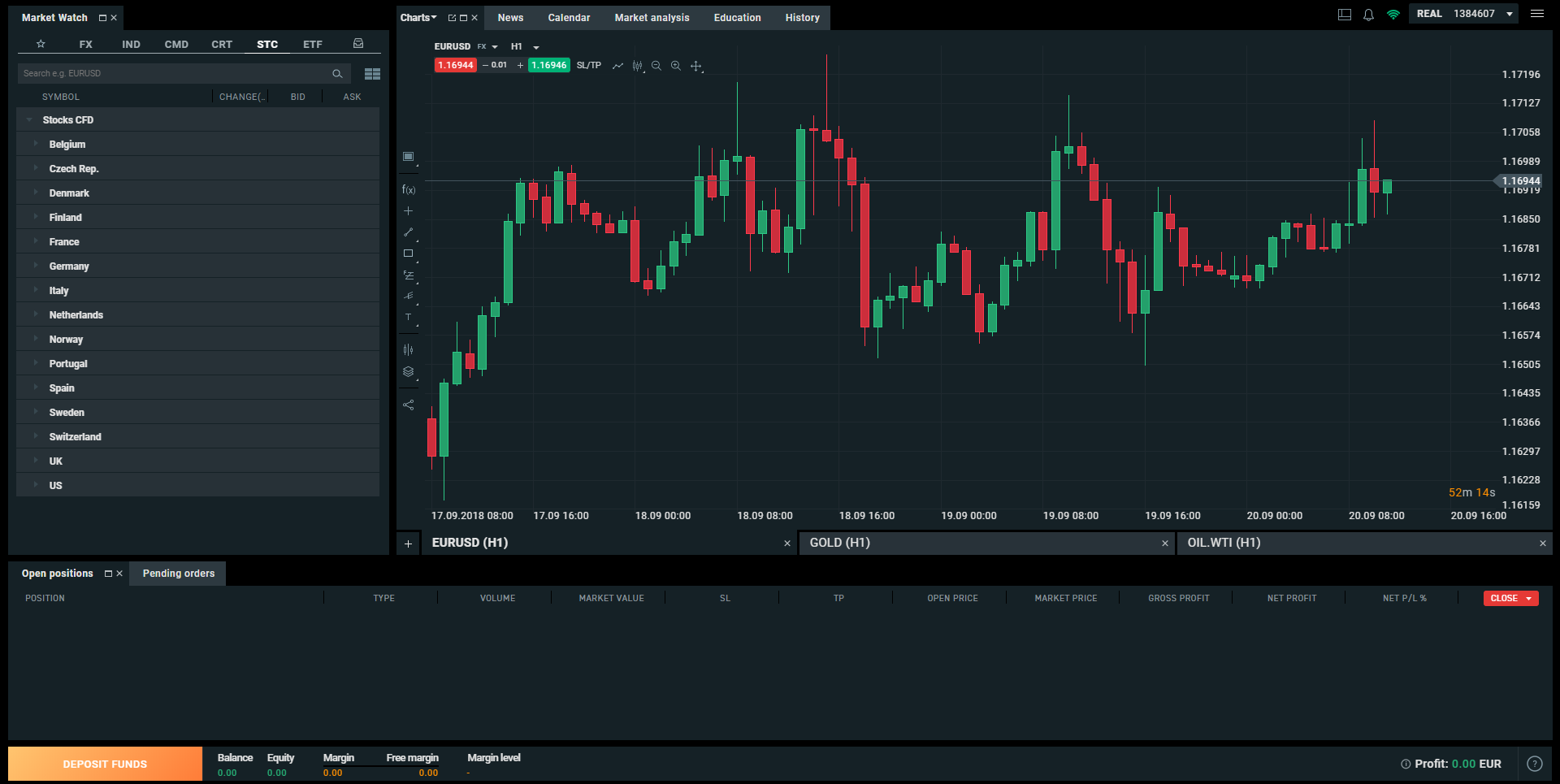
To get started, investors have to understand what a trend line is. This line indicates support and resistance to security. A support trend line indicates the level that prices will have problems dropping below. The resistance trend line shows a level where prices will have difficulty increasing. Both of these lines can remain at a set value or can change as time continues.

How do Chart Patterns Help?
Fundamentalists will decry the ability of chart patterns to help to trade along with that you can also rely upon a Trading Platform to understand these chart patterns. There is something to their criticism. Charts tend to reflect human nature and psychology. The only constant factor in the marketplace is the psychology behind greed and fear. Over time, these feelings can be charted because traders will respond in the same psychological way to most price changes.
Do Chart Patterns Work?
There is never a perfect solution for any investment vehicle. If a chart or trading program worked all the time, everyone would use it and it would stop being effective. Chart patterns are useful tools, but they will not be effective 100 percent of the time. Knowing how to use a chart pattern and which ones work best can increase the likelihood of a profitable investment.
What Type of Chart Patterns are There?
Although there are many types of chart patterns, there are a few common ones. They can be done for weekly, daily, or hourly trades. One of the most common ones is the head-and-shoulders pattern. It is extremely popular and resembles a head with two shoulders. It uses a reversal pattern and indicates when security will move against its former trend. A head-and-shoulders top shows that the security will fall when it reaches the peak. A head-and-shoulders bottom signals that the price will gain after a downward trend. It is comprised of a head, two shoulders, and a neckline. The neckline is basically a level of support or resistance. The pattern is confirmed when the neckline is broken. There is a possibility that the pattern will not play out in the forecasted manner. In a throwback, the neckline is broken and it drifts back to the original neckline. If a trend shifts, the old resistance, and support levels will be reversed.
Another kind of chart is the cup-and-handle pattern. In this chart, it takes on the shape of a teacup. This is caused by a bullish continuation pattern. It normally occurs after an upward trend before the security stalls. After it stalls, investors sell off the security. Once this occurs, it will normally trade flat for a while without any particular trend. To complete the cup-and-handle pattern, the security moves upward before it has a small downward move.


